User Problem
My Select membership users are experiencing a disrupted user journey due to the gap between two separate systems.
With the increasing demand for smart cleaning robots among users, the current My Select portal is struggling to meet their evolving needs. As part of our business strategy, many subscription service options are transitioning from the My Select portal to the iRobot system leading to limited selection of older subscriptions. As a result, users are left with no alternative but to navigate to another website to complete their robot purchases.
Solution
Fall apart the My Select system and integrate
it into Account page of iRobot system.
A comprehensive design system emphasizing
seamless integration and scalability.
Before integration

After integration

Design process

01 Reframe
Evaluate two system
The account page is where the iRobot system stores user personal information, and the team believes it is the appropriate place to integrate the My Select portal.
Insights are derived from the analysis of their content structures. In the case of both websites, the incompatibility of two system causes some of the info that can't be synced across the webs.
Repetitive information for both webs also needs users to put in double the effort to manage them. The presence of both horizontal and vertical navigation systems results in users requiring more time to adapt to the alternative system. Additionally, there is a lack of consistency in the design system, as it lacks a unified design language across the teams.

01 Reframe
Reconstruct to one
Prior to our project next phase, we formulated several concepts for reconstruction. Our team of UX researcher and I identified specific user behaviors and then gave priority to three key user stories. Insights gathered from users played a pivotal role in shaping the final decision concerning information consolidation.
We have chosen to implement Concept 2, which involves dismantling the current Select information framework and integrating it fully into the Account information framework. Our guiding principle in this approach is "Finding commonality while preserving distinctions."
01 Reframe
Scalable design
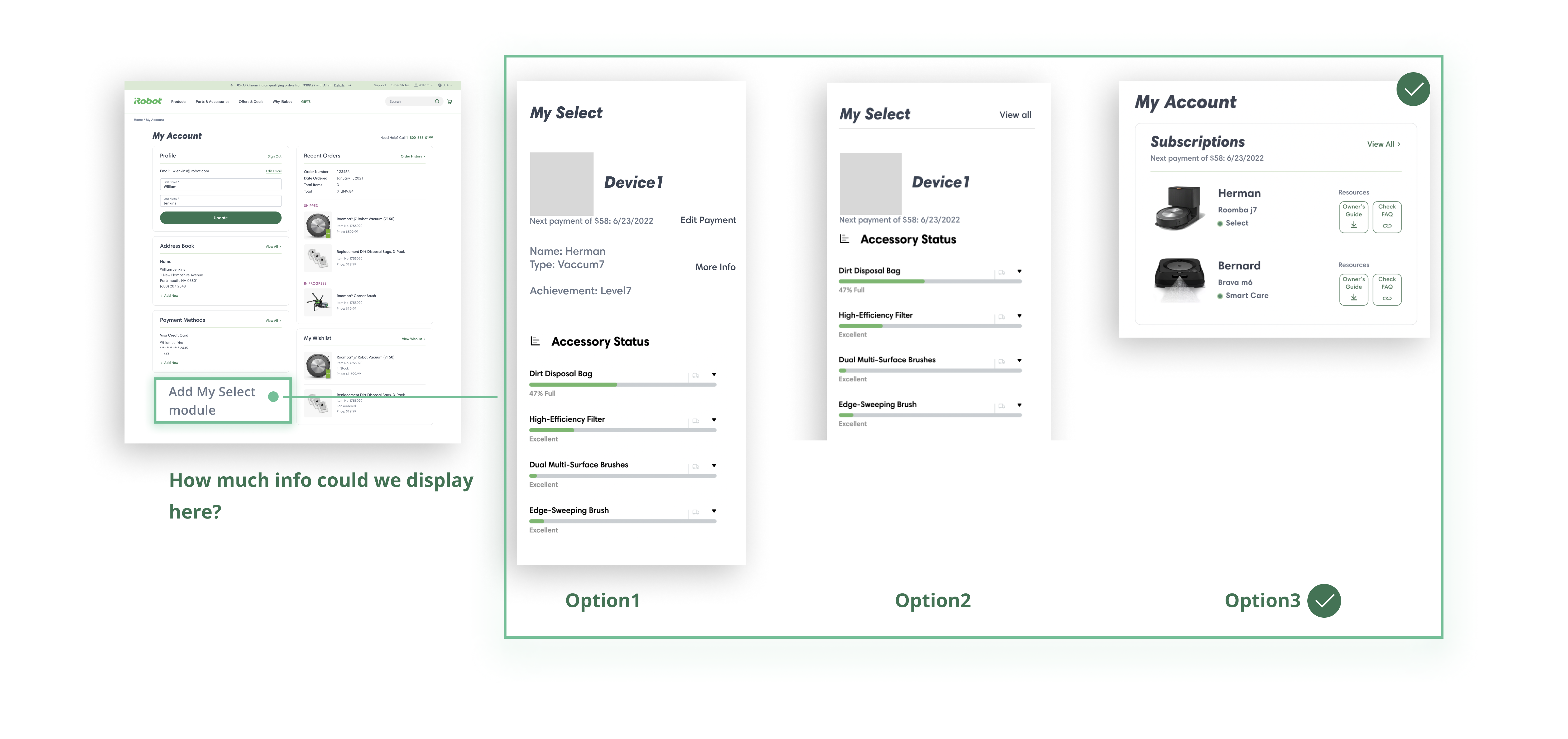
I decided to land on a "My Select Module + Tab design" decision due to its obvious and intuitive for users, scalable and minimal learning cost. Less learning cost means if My select users cancel their subscriptions, they will downgrade into regular users. The subscription module on the dashboard will be frozen or disappear, but the user flows of the other scenarios remain unaffected


02 iteration
Prioritize and detect issues
In the initial stage of the integration, our plan was to begin with one of the critical scenario, which is "accessory health tracking and installation". Concentrating on a small part within a larger scope enables us to utilize some prompt feedback and apply it to other scenarios.
I realized that certain issues within the My Select system could hinder the development of a seamless user journey. During this phase, we identified and enhanced some user interface issues.
02 iteration
Identify the start point
Determining what content to include and the quantity of content to place in the My Select Module became a challenge once we finalized our information structure framework.
But the conversation with the UX Researcher help us drive the Option3 design decision: Most of users can be directed to our subscription details website page through iRobot mobile application( they use it for controlling smart robots). As a result, we can minimize the content on the dashboard and put the details of the subscription underneath the My Select module.
02 iteration
Align the business need with the user need
This part is challenging due to the confliction between the business request and the user experience. Top promotion banner the customer team requested will decrease the chance that a user might dismiss an important message from their subscription.
To resolve this concern, I transitioned the business need into the user need. "Add regular devices" to the dashboard allows users to learn condition of regular robots and provide them with a chance to upgrade devices to a promotion protection plan or be a My select subscribed robot while their existing protections are approaching.


03 validation
Continuing iteration
To get quick feedback and shorten the timeline, I conducted an internal usability testing (n=9). All the testers are collegues who know the product well. By the end of the testing, we got:
100% task completion
Descriptive feedback
One feedback is beyond my expectation.
" What does that mean if the progress bar goes half through"
Even though we had redesigned the health status bar to make it more reasonable, 90% users said the messages that the health status bars deliver are not clear. In the iteration version, more insightful description varies upon the types of the accessory, which indicate the role one accessory plays and describe the impacts they will make in some conditions. So users get to know what actions they will take to keep cleaning seamlessly.

04 Scale
More robot cases
Users rely on the names they give to their robots rather than their similar appearances. Preserving the names while removing thumbnail images can free up additional space to accommodate future scenarios.

Release
No push for subscription users to try on the new version, but experimentally observe how they engage on it. The original My Select portal still works and functions as before, but we introduced a link to the new designs of My Account on the homepage of the My Select portal.
This resulted in a 25% increase in My Account usage, particularly for the subscription-related features. In addition to this metric data, there has been a gradual decrease in the number of subscription users using the portal. Moving forward, We anticipate that most subscription users will naturally migrate to the new designs